In the first image, I wanted to create a contrast that would bring the viewer to focus their eyes on her face and the image on her face. I painted the monarch butterfly on her face with makeup. Her face is off centered and placed at the bottom left of the picture. For lighting I used a lamp and I placed her in front of a dark backdrop.
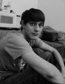
In the second image, I used a more candid approach and just took pictures as I sat with my subject on the ground. The lighting is indoor lighting, so it does not create a high contrast within the picture. I blurred the background in order to create more of a focus on the subject in the foreground.
For the last photo, I had the subject climb into a tree and sit on one of the branches. The lighting outside was quite dark, so I had to lighten up the photo in order to make it more viewable. The subject is placed off center at the left of the image. The viewer follows the subjects gaze which continues across the page until it leaves the frame. The viewer is left to wonder what the subject is looking at.


I like the last one the best. I think that the skirt looks beautiful draped over the branch... Maybe just a lil teeny bit more contrast?
ReplyDeleteI think the middle one could use more contrast too...
the first one draws me in immediately. the others have potential, but it seems that you might be having difficulty with focus?? they seem a bit soft so you might need to double check your focus.
ReplyDeleteI really like your first and last image - the first one has excellent contrast, and the last has a painting-like quality that is very calming. The second image has a nice composition and pose - maybe just add a little more lights to boost the depth of the photo?
ReplyDeleteI like them all but the one of Trace is my favorite. You and your art skills :P Maybe a little less feathering on the last one? The one of Michael is nice :) Maybe add a little more contrast.
ReplyDeleteThe middle photo could use more contrast.
ReplyDeleteI love the first one! I really like how she is slightly off center too.
1. The face paint adds something to this that makes the whole thing seem exotic and surreal…good work
ReplyDelete2. Maybe a tad more contrast…and I wish the depth of field was a little larger so the whole subject would be included
3. I love how smooth you got her hair to look…long shutter speed?